Activating the brand story behind annual reports
In collaboration with CAAT Pension Plan
See how we engage CAAT Pension Plan members each year with an interactive digital year-in-review.
Challenge
CAAT saw an opportunity to buck convention by sharing the compelling stories behind its annual financial reports.Solution
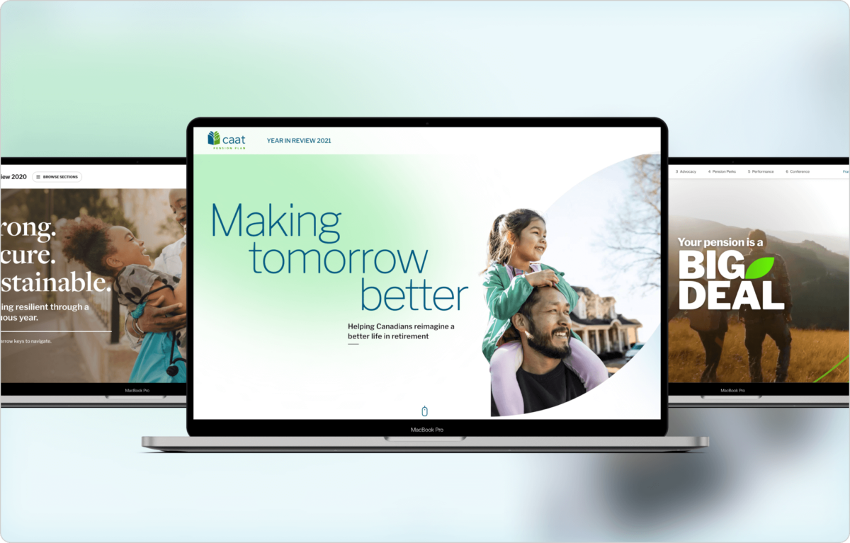
Interactive digital experiences help convey a stronger brand story, supported by photography, first-person stories and animated stats.Deliverable
Content strategyUX
Design
Development
Results
The annual year-in-review is consistently met with positive accolades from members and has won multiple awards.The context
Traditionally, CAAT Pension Plan releases its annual financials to stakeholders as a report. However, these conventional annual reports tend to be dry and dense and only have limited exposure to investors and other stakeholders seeking out specific information.
In 2020, CAAT came to Context with a request: create a digital version of its annual report that was engaging and accessible for everyone. After a year that had been unique in so many ways, CAAT needed members to be confident that their pension remained strong and secure.
Adopting a digital, user-centric format would more clearly convey CAAT’s benefits and features to plan members, provide accountability and transparency to investors, and serve as an outreach tool to engage prospective members and employers.
An annual opportunity to assess and reflect
We’ve gone on to develop CAAT’s year-in-review for three years running. Though the goal of an accessible, narrative-driven experience stays the same, each iteration has a distinct theme that speaks to the challenges and changes of another year gone by.

2020
After the emergence of COVID-19, global stock markets were volatile and many Canadians experienced financial hardship. CAAT Pension Plan knew that many members would be worried about whether their lifetime retirement income was secure. We met their concerns head-on with a clear narrative in plain language.

2021
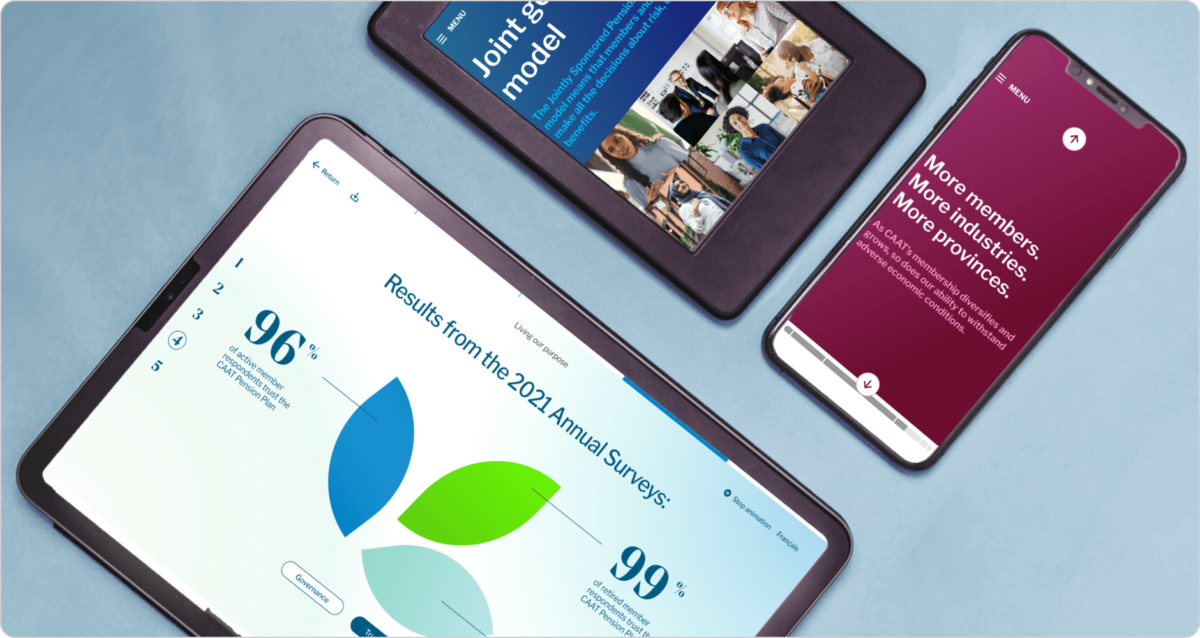
As the pandemic stretched into its second year and Canadian workplaces evolved rapidly, CAAT’s year-in-review looked to the future with themes of resilience and evolution. Taking our cue from CAAT’s logo, we debuted a leaf motif and a new colour scheme to strengthen brand recognition.

2022
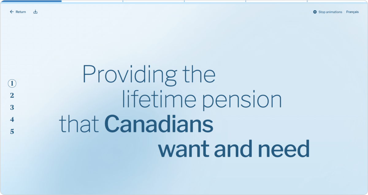
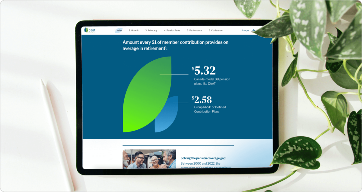
After another turbulent year in the stock market, we drove home CAAT’s value proposition with a thematic emphasis on growth and momentum, and highlighted its vision of providing pensions for all Canadians. On the development side, we enhanced the user experience with mobile-first design.
A compelling story unfolds with long-scroll format
Pension plans are, ultimately, about people. Each iteration of the year-in-review offers a user-friendly overview of CAAT’s innovative approach and how its pension plan offers secure, predictable lifetime retirement income. More importantly, the digital year-in-review makes the content accessible; it’s easy to read, easy to understand and easy to scroll through.
An interactive format integrates bold colours, emotive photography and animated graphs to help users better understand the significance of key dollar amounts, while authentic client testimonials draw the reader in. The microsites incorporate clear section navigation and, starting in 2022, a mobile-first design approach to ensure a great experience on every screen.
The advantage of a digital report is that you can take engagement a step further by providing opportunities to learn more, complete a survey or register for upcoming events, depending on the year. The year-in-review also doubles as an effective sales tool that encapsulates CAAT’s mission and vision in a clear, contemporary way.
“The digital year-in-review was amazing: very slick, clearly presented facts in a scroll-down, user-friendly format. Please do this again next year!”
— CAAT member
“I am very pleased with The CAAT Plan, how it is designed and managed. In these turbulent times, it is very reassuring that my pension remains secure. The content and style of The CAAT 2020 annual report were excellent. Thanks for the continued fine work.”
— CAAT member
Ultimately, the one result that really matters is: can users access benefits?
The first digital year-in-review in 2020 exceeded all original KPIs, nearly doubling its total views and surpassing webinar sign up goals. In a follow-up survey, 89.5% of respondents rated the experience as useful, easy to navigate and understand.
The 2022 year-in-review earned three Hermes Creative Awards, an international competition recognizing creative excellence in marketing and communications content.
We’ve continued to surpass targets and take pride in a successful collaboration with clients who embrace an innovative, forward-thinking approach.
“Thank you for your fantastic work on our digital year in review. Your team was innovative, responsive and a pleasure to work with.”
— Russell Evans, VP Communications, CAAT Pension Plan
Explore CAAT’s digital year-in-review reports:
