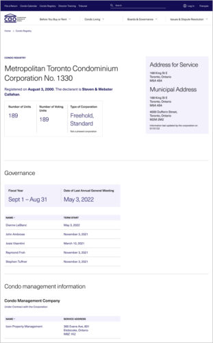
Bringing clarity and accountability to condo living
In collaboration with Condominium Authority of Ontario (CAO)
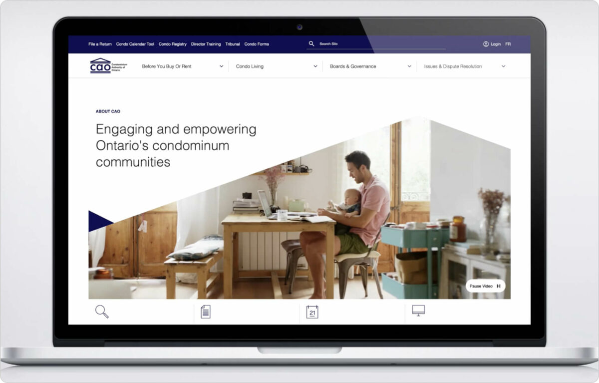
As the authority for rules around condo living, CAO needed to make its users feel right at home with an intuitive, user-friendly website.
Challenge
CAO is a newly-created authority with a complex mandate and multiple audiences. How could we streamline its website to realize its potential as an important resource hub for condo communities?Solution
A user-centric site redesign that makes it easy for all audiences to find and understand the answers to their questions.Project Scope
Stakeholder consultationUX and content strategy
Information architecture
Website design
User testing
Website development
The context
The Condominium Authority of Ontario (CAO) is a provincial authority that provides information, education and dispute resolution to condo owners, residents and directors.
CAO was established out of an overhaul of the Condominium Act in 2017. Before this time, condos in Ontario were largely unsupported; it was up to individual condo boards to make decisions and settle disputes within their buildings. With Ontario’s condo population booming, it has become more and more urgent to establish strong consumer protections and support condo communities.
With CAO in place, condo stakeholders finally had a hub for transparent regulations and arm’s-length dispute resolution services. But as more people became familiar with CAO’s new role in the condo ecosystem, the original site needed to be revamped to get users to the information they needed faster.

Getting to know CAO’s users
First, we explored the distinct goals and needs of each user segment through a digital survey and consultation process. We spoke to not only the end users of CAO’s site, but the entire information services team, who take care of CAO’s phone lines and had firsthand knowledge of where users typically run into confusion.
“The work Context did on our website empowered us to bring additional clarity to the way we communicate important condo living information on the web and beyond.”
—Aleks Dhefto, Manager, Communication & Outreach, CAO
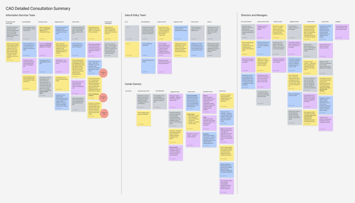
Transforming a content maze into a content map
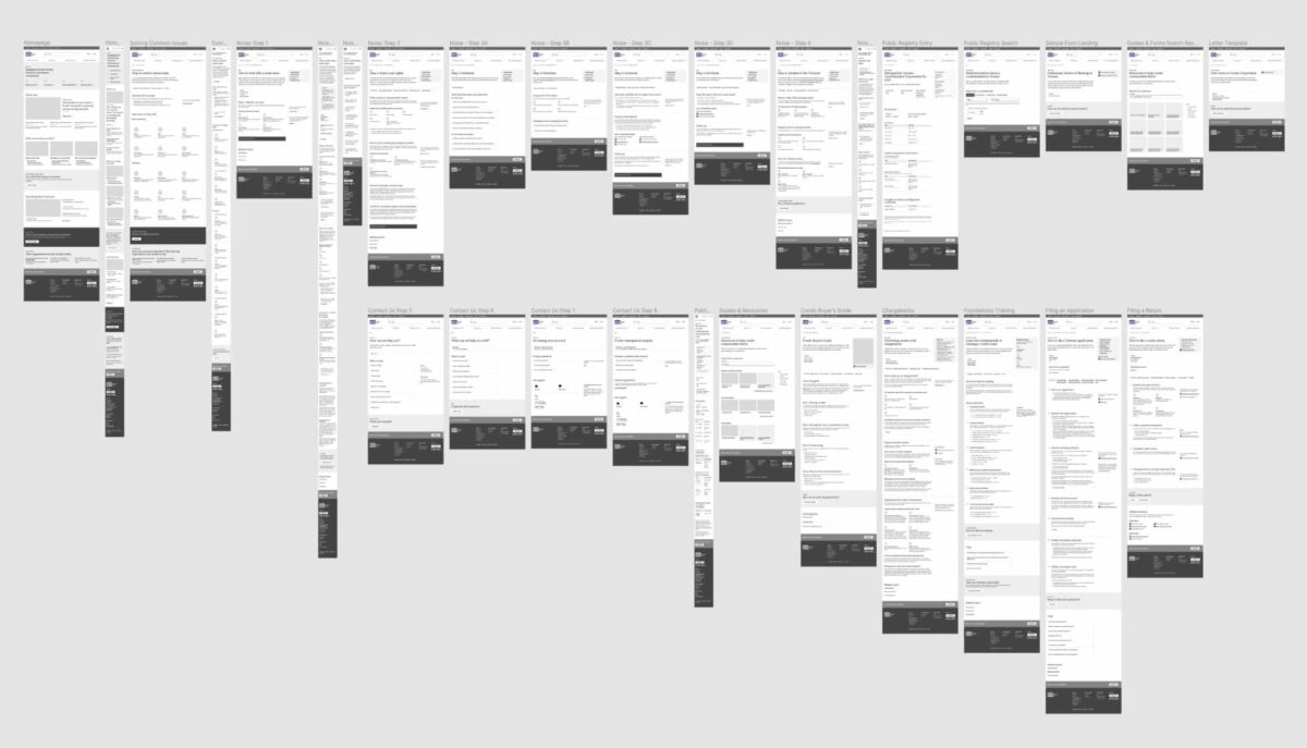
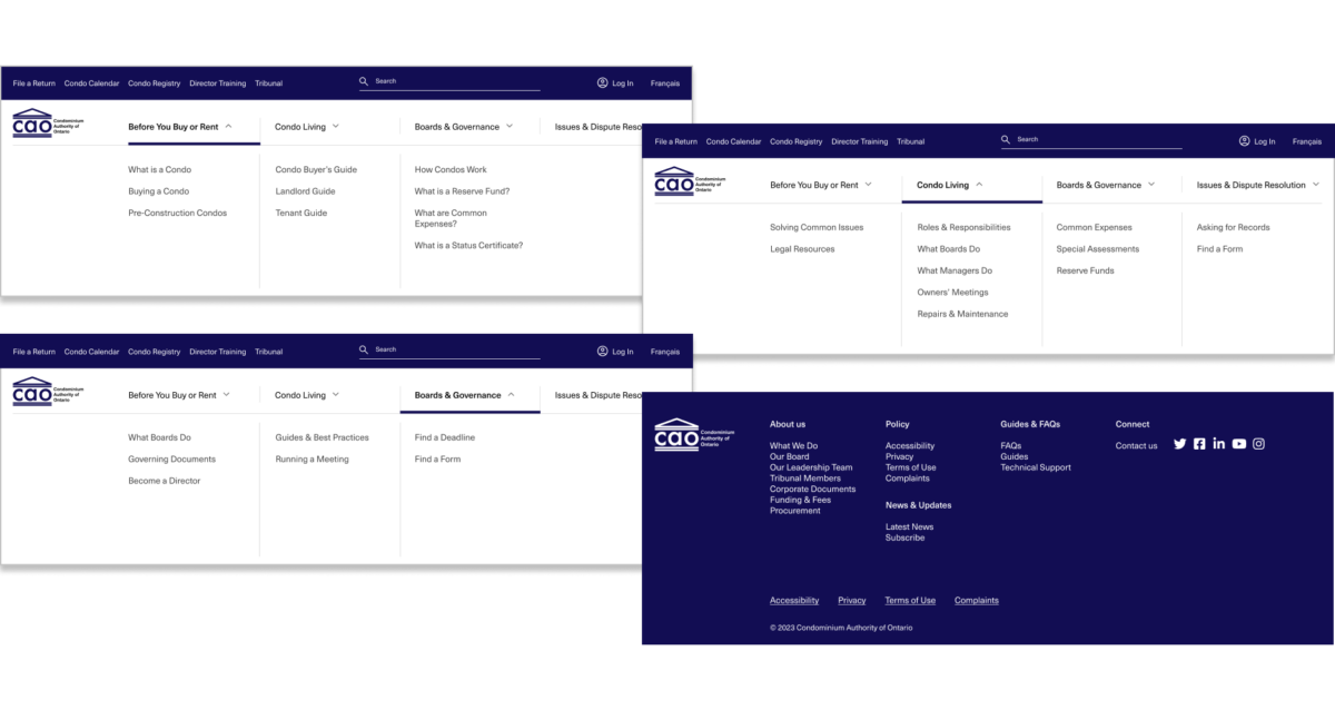
Our next step was assessing over 250 pages of core content to pinpoint any gaps in navigation, as well as opportunities to simplify and condense.
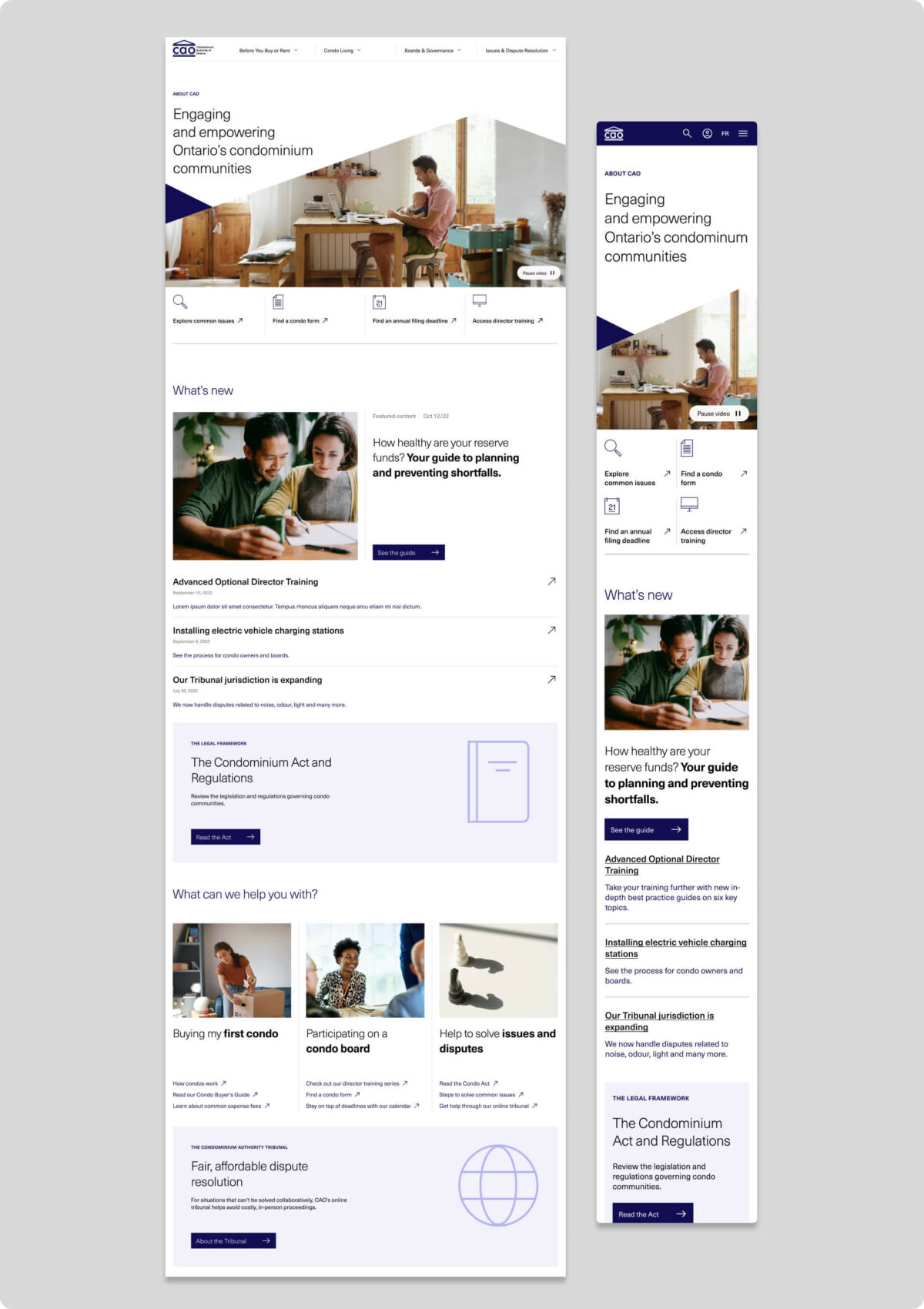
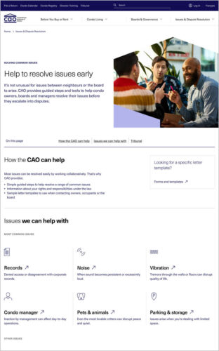
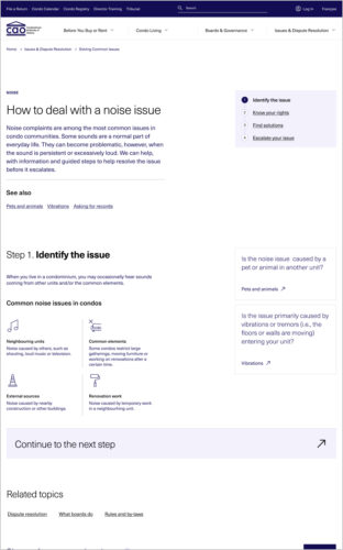
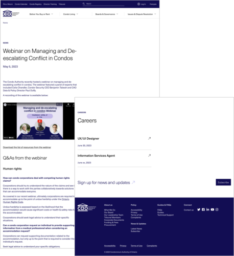
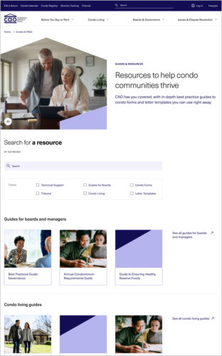
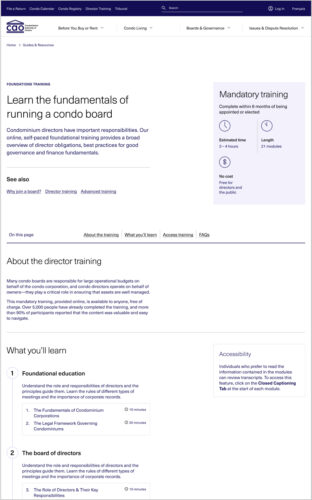
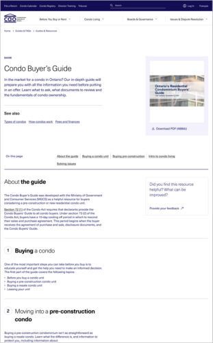
Guided by the principles of “intentional wayfinding,” we reimagined the flow of the site to align with real users’ journeys. We uncovered opportunities to front-load important information and link related content, so that visitors could take in pages at a glance and move naturally from step to step. We upgraded the search function to weight results by relevance and advised CAO on how to break up content into easy-to-scan sections.
The creation of high-fidelity wireframes allowed us to move into the next phase: user testing.
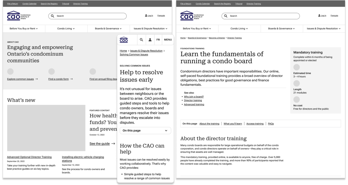
Connecting the dots through user testing
We knew visitors would be landing on CAO’s website with very different goals. So we engaged with every type of user to test different scenarios and ensure that nobody was left behind. With each round of testing and feedback, the wireframes evolved, becoming more and more in tune with users’ needs.
“This is an excellent website for condo owners to get to know their rights and responsibilities. Everything is in one place and easy to find.”
–Survey participant
Pulling it all together with fresh design
In the final stage, we gave CAO a whole new look. We visually decluttered through use of negative space and incorporated motion to liven up text-heavy pages. Bright lifestyle imagery and custom iconography added a friendly, approachable feel to the site.
